I used to struggle a lot with baseline grids or baseline rhythms. I have no idea about you, but it just bothered me and I could never get a grip on it. I could definitely see the point though: making sure that text is aligned when two columns of text are next to each other seems like such an obvious thing for a classically trained Graphic Designer.
I literally tried everything. From Adobe Air em calculators to baseline grid calculators to Os X Dashboard widgets to using Photoshop scripts and layers for generating horizontal rulers. Some sidenote text would look like shit because it was set in all caps 15px, adhering to my 28px baseline grid. Whitespace was completely off but I was scared to tweak it, because my baseline was set at 28px height and everything had to adhere to that vertical rhythm in order to work.
It was a mess and it sucked. Tools were limiting my design and I hate when tools start doing that: you end up spending more time taming your tools than doing the actual design work. I was so completely wrong and I could not see it. I almost gave up on baseline grids. Almost.
Then it became clear to me: I was focusing too much on using line-height as a base unit. It’s not about line-height, it’s about the rhythm. If you click through the next fifteen slides from this presentation, you will quickly see what I mean:
Baseline Grid Workflow in Practice
How does that work in practice? It basically takes five simple steps:
- Choose a typeface.
- Define font-size and line-height.
- Find your interval number.
- Set up a Photoshop grid.
- Write CSS with your interval number in mind.
1. Choose a good typeface and set a piece of body text.
I really like to use Typecast for this part. But you can do it in Photoshop, Fireworks or straight in HTML & CSS as well.
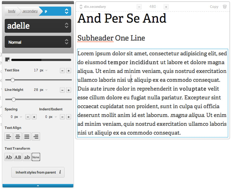
2. Define a good base font-size and accompanying line-height.
Trust your design judgement. I might write a follow-up post about finding a good font-size and line-height. Let me know via twitter or in the comments if you are interested!
3. Find your interval number
This is what it is all about. Divide your line height by three or four and remember it. Never fucking forget that number, it is the heart and soul of your design and it will define everything. It’s okay to think in pixels, but I prefer to think of it as a unitless number.
A typical example would be Helvetica set at font-size: 18(px) and line-height: 28(px). Dividing the line-height by 4 will give me the interval number 7. Every following thing I do will be based on the number 7. A piece of sidebar text set at font size 15 that looks weird on a line height of 28? Set it at a line height of 21 (7 × 3). A header running over two lines, set at font size 30 that looks weird on a line height of 28 or 56 (28 × 2)? Set it at a comfortable line-height of 42 (7 × 6).
4. Set up a Grid in Photoshop for some Baseline Grid guidance.
In Photoshop CS6 on Mac Os X, you can find the Grid options under Photoshop > Preferences > Guides, Grids & Slices. I prefer using this for the baseline grid so I can toggle my (vertical) baseline grid and (horizontal) column grid on or off separate from each other — I use rulers for my column grids.
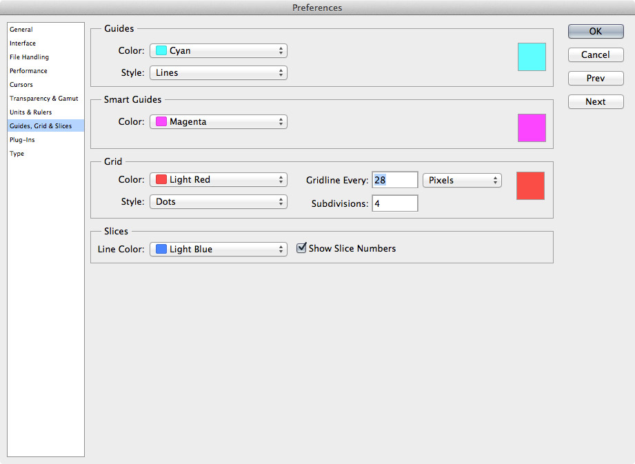
This is how I configure the options for the Grid:
- Style: is set to dots so I can see my grid without it interfering with my design.
- Gridline Every: is set to the line-height unit I defined. For example: 28 (pixels)
- Subdivisions: is set to the divisions needed to obtain my interval number. If my line-height is 28 pixels and I defined my interval number to be 7, Subdivisions would be 28 / 7 = 4.
5. Write CSS With the Interval Number in Mind
The last step is to write your CSS with the interval number constantly in the back of your mind. Need to define the navigation bar height? Vertical padding or margin values? Line-heights? They should all be multiples of your interval number.
I even like to go as far as get a little Sass aid. I define my interval number in a variable and use that to calculate the various numbers throughout my stylesheets. Saves a ton of time, especially if you decide to change your interval number at some point. If you prefer writing your CSS without a preprocessor, Alfred for Mac is an awesome app to quickly do some calculus if you’re lazy like me.
Things Will Break
Last but not least: some things will break your vertical rhythm. This is perfectly normal. A vertical rhythm is important to create a coherent look and feel and a pleasant reading and scanning experience. But when your design gut feeling tells your something different, please listen to your gut feeling.
What is your experience with vertical rhythm / baseline grids? I’d be happy to hear about it in the comments.
Read Up on Vertical Rhythm
These are some excellent articles that inspired me to start thinking about vertical rhythm in the first place:
- Read Setting Type on the Web by Wilson Miner
- Read Compose to a Vertical Rhythm by Richard Rutter


I was recently looking at implementing a baseline grid on a complex responsive site and came across your article. I was curious as to how you determined the division by 3 or 4?