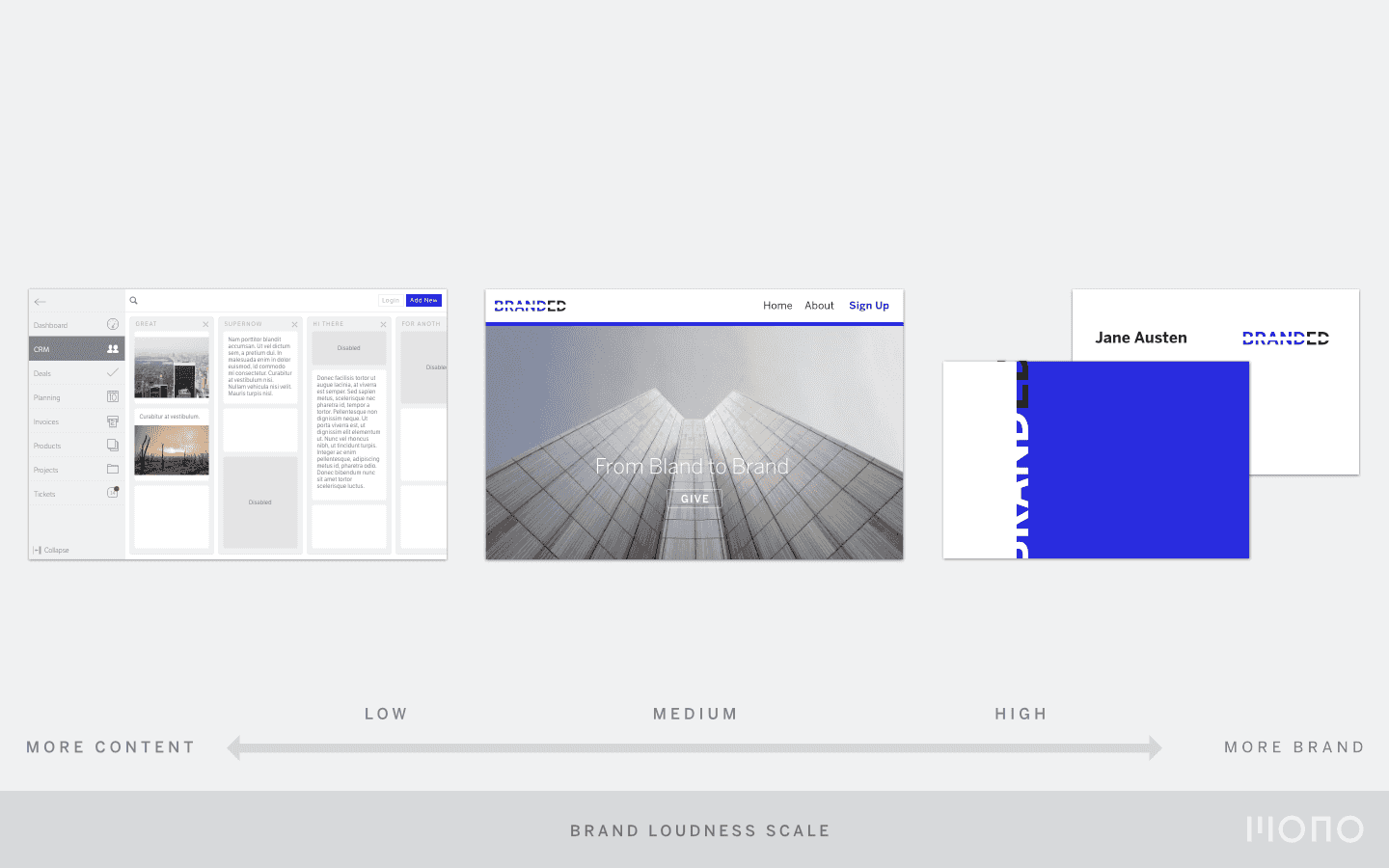
Something I have explained to clients in recent UI design projects is the concept of Brand Loudness. I was surprised to find that not many people use this concept to navigate their different brand assets. It helps to make smart design decisions while reinforcing your brand. Time to dive into it a bit deeper.
You already have a Brand Loudness scale
Brand Loudness is a subjective term. It indicates how customers perceive the loudness of your brand for a particular brand asset. Say, a name card versus a mobile app. One should appear louder than the other. My guess is you know which.
Brand Loudness is a scale on which you can map various brand assets. You might not know it, but you probably already have a scale. I bet your namecards feel more branded than, say, your website. And that is great news. It means your designers have taken the purpose of each asset into account.
A namecard can be bold and loud. Your web app should let the content speak first. And your chat service should completely integrate with the platform.
Now you should make it explicit
Brand Loudness is a tool that can be part of your brand guidelines. Powerpoint will get you a long way to map out your current assets and put them on a scale from subtle to loud. We help our clients create this if we feel they need it.
It can look like this:

An example of a Brand Loudness Scale
Once you make Brand Loudness an explicit part of your brand guidelines, you can evaluate current brand assets. Sometimes your brand is loud, sometimes it is subtle. All brand all the time will drown your customers in a sea of noise. A dot of colour stands out when it is surrounded by a sea of whitespace.
Your brand is a continuum
I work with interfaces every day. Some are more complex than others, all of them have a high degree of interaction. The cornerstones of branding seem juxtaposed with good user interface design. Brand should be in your face, memorable, omnipresent. In software applications, you want the content to be front and center. And the brand to move out of the way.
For a UI designer, this is a typical predicament. We might get a briefing from the marketing department that the logo should be on every screen of the native mobile app and that all buttons should be red. This becomes a design problem. And the result is a digital tool that nobody really wants.
In reality, branding and UI design work together. If you take into account Brand Loudness. A brand has multiple dimensions: what it looks like, what it feels like and also how it evolves over time. It helps to see brand as a continuum, not a fixed event. A Brand Loudness scale will help you to navigate that continuum and design better software and applications. Which will reinforce your brand.