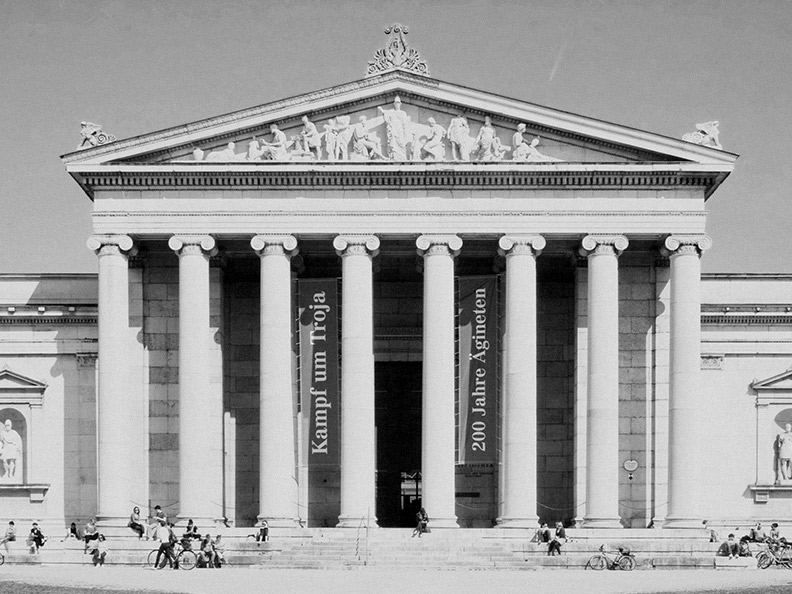
Alain de Botton’s “The Architecture of Happiness” is one of the best design books I recently read. I learned that there used to exist a canon of beauty. During for instance the Classical period, people simply agreed on what a beautiful building looked like. Beauty was defined by architects, who were, at the time, highly regarded artists.
At one specific point, this was the solidified code for a beautiful structure:

For a long time, society agreed that beauty was imposed on an object or structure by an artist – someone who knew how to make something “beautiful”. Emergence of engineering schools like the Engineering Academy of Dresden lead to new knowledge, new technologies, new possibilities — history has a funny way of repeating itself.
Engineers had a different way of approaching architecture. They avoided embellishments and preferred so-called honest structures. Structures where function came before beauty. Structures where the visual and tactile qualities were derived from meaning – as opposed to being imposed by an artist. Modernism was born.
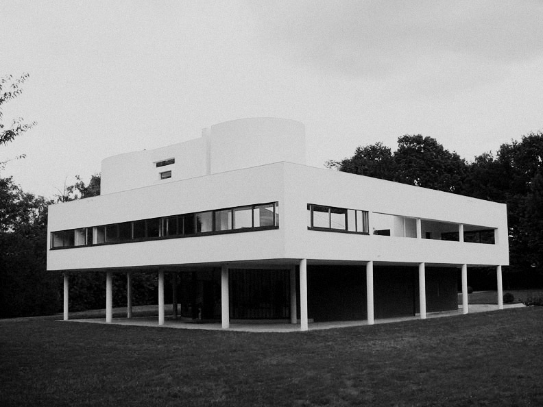
During that period, Le Corbusier designed the Villa Savoye. A building that even today looks like a temple to anyone seduced by modernist views:

Straight lines, pure materials and no useless decoration. Modernist perfection. And also completely uninhabitable, courtesy of a leaking flat roof and generally spartan comfort. What modernism was about on the surface had become something of itself to strive for. The very thing the first engineer-architects were protesting against had now become their trademark. And modernism had become its own aesthetic.
That really made me think. Once we name things, they stop being what they are and become a thing of their own, with an aesthetic of their own worth mimicking. When I hear designers talk about flat design being more honest or better, I think about modernism and Le Corbusier. You cannot name something after its visual aesthetic and then call it more honest. Honest design is much more complex than that.
Architecture has already gone through that phase and I believe we can learn from their mistakes. When we design complex interfaces, there is no benefit to hiding all the complexity behind an apparently simple visual aesthetic. Design goes much deeper than that. At least 40% of design is defining the problem. Another 40% is convincing everyone in the room that the proposed solution is the right one. “We made it flat.” won’t do.