Xavier Bertels

I’m Head of Product at Phished. Previously CPO at SweepBright and co-founder of Mono.

Full-screen applicaties: de gevolgen voor web usability

Het is voor de meeste web designers en front-end developers vanzelfsprekend, maar vandaag werd ik weer hard met de neus op de feiten gedrukt: een link automatisch in een nieuw browservenster laten openen vormt een usabilityprobleem.

Het meest gehoorde argument is dat bezoekers in de war geraken—zie Jakob Nielsen: Top 10 Mistakes in Web Design. Je zou kunnen redeneren dat zoiets alleen van toepassing is bij bezoekers die niet zo oplettend zijn: de Vorige knop wordt immers uitgeschakeld, waardoor je gewoonlijk wel merkt dat er een nieuw venster geopend werd. Het is éen van de vele visuele hints die ervoor zorgen dat je meestal zonder al te veel wrijving terug kan geraken waar je wou zijn.

Back to the Future

Als gevolg van het terugkeren naar fullscreen computergebruik (zie OS X Lion & Windows 8) gaat dat type argument helaas niet meer op. Tijdens een fullscreen surfsessie (op mijn 13″ scherm geen overbodige luxe) opende een link zonder enige aanwijzing een nieuw venster. Omdat fullscreen surfen betekent dat je geen browserinterface ziet, had ik geen aanwijzing dat er een nieuw venster geopend werd. Ik wilde graag terugkeren naar de pagina waar ik vandaan kwam, maar aan mijn swipe naar links werd door de browser geen gevolg gegeven—normaal gezien keer ik daarmee terug naar de vorige pagina. Omdat ik geen feedback kreeg wist ik bovendien niet wat er aan de hand was.

Het probleem met externe links oplossen

Je kan zeggen dat zoiets voor een stuk aan browsermakers ligt en dat klopt ook. Ik kan minstens vijf manieren bedenken waarop een browser duidelijk zou kunnen maken dat er een nieuw venster geopend werd—ook in full-screenmodus. Maar web designers hebben de verantwoordelijkheid om zich aan de huidige situatie aan te passen en dat betekent rekening houden met de huidige beperkingen van full-screen browsen.

Persoonlijk zou ik het probleem oplossen door de bezoeker bij bepaalde links de keuze te geven om het in een nieuw venster te openen of niet. Op die manier is a priori duidelijk welke actie volgt na een interactie. Via jQuery/JavaScript kan je achter elk ankerelement met bijvoorbeeld een rel="external"- of class="external"-attribuut tussen haakjes de link te herhalen met een target="_blank"-attribuut. Quick and dirty ziet dat er als volgt uit:

$(document).ready(function() {
	$('a[rel="external"]').each(function() {
		$(this).after(
			" (<a href=\""
			+ $(this).attr("href") +
			"\" target=\"_blank\">Open in nieuw venster</a>)"                      
			);
	});
});

Web apps moeten zich gedragen als native apps

Waarom full-screen HTML5 websites een grotere toekomst hebben dan native apps is voer voor een andere post. Maar het probleem dat ik eerder omschreven heb past wel in een groter kader waarbij het voor een web designer nog belangrijker wordt om rekening te houden met het feit dat de browserinterface straks helemaal afwezig is. Eenvoudig gezegd betekent het dat je elke website als web-app kan behandelen: met een eigen interactiemodel en voldoende visuele clues waaruit bezoekers die interacties kunnen afleiden. Wat die clues juist kunnen zijn zal ik in een volgende post proberen samen te vatten.
Designer Snobbery

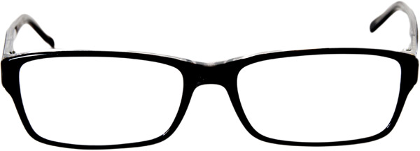
Snobby Designer Glasses

The design profession is one where we get to deal with a lot of different types of clients. I divide them into three categories. There are some dream clients that say “You are the expert, I just want to communicate this and this and you need to make it happen.” There are also some clients that are a bit harder to work with. Not because they have bad intentions, but rather because there is a fundamental communication gap. For instance, when we talk about designing a logo. The word logo has a very different meaning for people who are not active in the design field—in fact, there is even confusion within the design field. Finally, there sadly are some clients that simply have bad intentions.

If you are in a creative profession and dealing with clients, this probably sounds familiar to you. As a matter of fact, there is a whole website devoted to so-called bad clients. However, a recent post on Clients From Hell made me realize that designers sometimes jump to conclusions all too quickly—not all 12pt fonts look the same, it is the x-height that really counts. I would even go as far as saying that the much-quoted phrase “we have to educate our clients” is outright snobbery.

Our biggest weapon as designers is empathy. Empathy is the unique competitive advantage a good designer has over a not so good designer. Our main job is to seek and understand our clients’ underlying wishes and translate that into an awesome design. We should not be snobby when clients do not speak the lingo or when clients appear to be utterly stupid. They rarely are. From the moment we feel that way, we should look to ourselves, because it is often us who are being ignorant. It is us that are failing to comprehend our clients’ wishes. It is in fact us that are being utterly stupid.

So here’s to you, dear clients!

Steal the Web

The amazing speed at which the web has evolved over the last years really got me thinking. How is it possible that there are so many amazing websites out there? How is it possible that the web keeps on evolving at the steady pace it has been evolving the last couple of years?

Sure, in the light of history, it is a fairly new technology. And at the sunrise of new technologies, things tend to be very dynamic. But I am convinced that at least part of the answer lies in the fact that the Web is inherently Open Source, something that we have unfortunately lost in many other fields (music to name one).

You can navigate to almost any website and view the source code. Then copy it and change it to your needs, learning invaluable lessons in the process. Yet, nobody is complaining about loss of income. The web industry is, all its perks included, inherently the best industry in the world when it comes to openness. Let us keep it that way.

WebP vs JPEG

There’s an interesting discussion going on Think Vitamin about WebP. Head over to the comments and read some really good points being made.

WebP is an attempt to solve one part of the speed aspect of images (it does nothing for latency, something that’s usually a bigger problem than file sizes). In this attempt it totally drops the ball on everything else though, which is a horrible tradeoff. Now if Google actually addressed these issues and added ICC v2, v4, alpha layers and metadatasupport it would be very interesting and I’m sure Mozilla would agree, but right now they’re taking the sane and logic stance. Adding an obviously unfinished image format to Firefox makes no sense.

— Tozz Erik Johansson in the Comments

I agree that the web should move forward. But moving forward at any cost is plain stupid. At least some time for reflection should be given, so people can make informed decisions. Yes, the W3C is slow, but I have the feeling that other people are trying to move way too fast.