Xavier Bertels

I’m Head of Product at Phished. Previously CPO at SweepBright and co-founder of Mono.

Designer’s Poison: Miseducating Designers

I found the following quote on the ever-insightful blog of Frank Chimero. He is currently writing a book called The Shape of Design. I was too late to help fund it via KickStarter, but I hope that I can still buy it when it is finished. Here’s why:

The miseducation of a designer. If it’s wrong for a client to believe the value of design is in the nouns, it’s also incorrect to educate a designer around nouns. Curriculums shouldn’t be focused towards teaching software or creating specific artifacts. The education of a designer should not be focused towards working in specific mediums any longer, because those mediums change so frequently and often congeal into one another into new hybrids. Everything is a campaign now. Schools would be wise to focus activity around objectives rather than tasks, because so much of professional work is around objectives too: devising plans to fulfill those objectives, creating a symphony of efforts that work together towards that goal, and then executing those efforts in a way that adds value. By focusing on objectives, curriculum will age better because instructors can be agile about the tools that they teach as the world around the university changes.

— Frank Chimero, taken from Designer’s Poison

New display for Graphic Design and Web Design work

After asking around on twitter, doing a day of research on Google and YouTube and mainly reading TFT Central and some forum posts, I have finally bought myself a new display for graphic design and web design work.

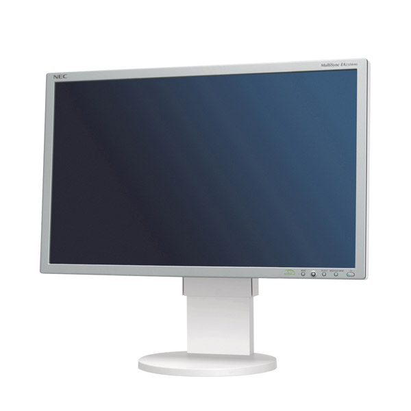
NEC EA232WMi Display

Meet the NEC MultiSync EA232WMi. You can read the full review on TFT Central, but here are some of the key reasons I have chosen to go with NEC in stead of the more “classical” choices such as Dell, Samsung or Apple:

  • 23 inch is just the perfect size for me. The bigger 27 inch screens always seem so overwhelming to me. I work with them at school and I think they are just too damned big.
  • The display is based on an e-IPS panel, which is a panel that has very interesting characteristics when mainly working with 2D still images. The most important one is the wide viewing angle and resulting colour/contrast consistency.
  • As much as I like the characteristics of CCFL backlighting, it does have a slower warm-up time and it contains Mercury, which is not exactly environmentally-friendly. The power consumption of LED backlighting is also less than that of CCFL backlighting, which is definitely a positive thing.
  • The display has the best panel uniformity I could find in this price category, which is important when working with still images. I‘m not that big of a colour-calibration freak, but I do believe it is important that a solid colour looks the same in every corner of your screen when designing.
  • There are four extra USB ports on this display, which makes it perfect to plug in my printer, one backup disk and a Unifying receiver.
  • I can connect the display via DVI, VGA or DisplayPort. More than enough for me. I have it connected via DVI for now. Perfect!
  • Very important: all of the necessary cables are provided with the display! I cannot stress this enough. NEC delivers a VGA, DVI, USB, Audio Mini-Jack and power cable. For the first time in my life, I did not have to go through the disappointment of having to go to the local electronics shop to buy the right cables. Bliss!
  • On the downside, the display has a slower response time (14ms), but since I am not that big of a gamer, I could not really be bothered by that. You always have to make a compromise of some sort when you are on a budget and in my case, I decided very quickly that a fast response time is not important to me. A not so fast response time is also very relative, movies still look awesome on this display. I don’t notice any motion blur at all. But I can imagine that this might be different for frequent gamers or motion picture editors.
  • At €324,36 it fit perfectly within my budget.

The Only Script in Your Head

The only <script> in your <head>: Head JS is an asynchronous JavaScript loader for all of your external scripts. The scripts load in parallel, but are executed in order, so in case you have a jQuery plugin that should be executed after jQuery is executed, head.js will take care of it.

The full version of the script also contains some widely-used JavaScript that is loaded on most modern websites today. For instance a CSS modernizer (akin to modernizr), an HTML5 enabler (similar to html5shiv) and a JavaScript feature detection module are incorporated in the full script. But no worries: there is also a head.load.js version, which only contains the loader, in case you do not need all of the extra stuff.

Finally, if you have a Google account and if you, like me, believe that it would be tremendously cool to have head.js available on the Google CDN, head over to head.js on Google AJAX api’s and give it a star!

Looking for a Corporate Typeface

Since February 2010, I have been running my own design company. As it goes, I have not yet taken the time to properly design my own identity—because client work always comes first, right?

I think that by the one year celebration of my company next month, I should at least have decided on some very basic stuff. One of the things that I would like to do by then is choose the corporate typeface I will use in my communication. These are the candidates on my shortlist:

Communication of course, also includes digital communication. It is important that I can find a typeface which I can use for stationery and for the design of my website and other web related projects that need similar branding. After doing a little research on websites like Typekit, Fontdeck and Fonts.com, I came to the staggering conclusion that only one of these typefaces is easily available via a webfont serving site: FF Dagny on Typekit. Which is an extraordinary, beautiful typeface.

If anyone has any great suggestions for fonts that also have an awesome digital counterpart, I’d be happy to hear about those suggestions in the comments! Meanwhile, my search continues. I am not satisfied with the idea that my final choice has to depend solely on technical limitations.

Web Design in the Touch Era

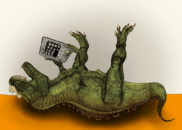
Illustration - Miet Claes

Illustration Copyright © Miet Claes

Have you ever used a touch-screen device to browse the web? Chances are quite real that you have. iPhones and iPads were only the scouts of the army of touch-enabled consumer devices set out to conquer worlds and recent iPad sales statistics show that touch is here to stay.

Meanwhile, keyboard and mouse will probably stick around for another decade. This has some serious implications for webdesigners, as they need to come up with a design that works on a myriad of devices. Responsive webdesign for instance, is a principle that we can use to overcome the problems that varying screen resolutions bring along. But there is one very basic design conception that not all webdesigners know about. It is called feedback and it needs some explanation.

When I was in kindergarten, my teacher Denise taught me how to write with a pencil. At first, the device did not work properly: I could tell by the absence of grey lines on my piece of paper. My mentor explained to me that I was holding the pencil upside down. I turned the device around and started drawing again. Lines appeared and I knew that I was doing something right. I got immediate feedback.

A lot of pencil training sessions later, my beloved writing tool was replaced by a so-called Personal Computer. I started browsing the web. Sometimes I would click on a link, and nothing would happen. Either the following page was loading slowly, or I had not properly pressed the mouse button. I could usually exclude the latter, since the mouse was designed to provide me with a nice click sound and some friction. It provided me with immediate feedback.

Recently, I bought a mobile phone with a touch screen. I regularly surf the web and inevitably click on links and buttons. Sometimes, nothing happens. Is it the slow connection or did my skinny fingers miss the clickable area? There is no way to tell if I have actually clicked on a button or link, because there is no tactile or auditive feedback like I had with the mouse. This is a problem though, that can easily be intercepted on the webdesigner’s end by:

  1. Setting a proper :active state for links and buttons in the CSS file. It is often neglected, but so important to make a visual distinction between a link that is touched and not touched or clicked and not clicked.
  2. Providing a clickable area that is large enough so that clicking on a link or button does not become Odysseus’ Journey. Add some padding to your anchors!
  3. Adding interaction sounds on touch/click events. Time to dive into jQuery and html5!

Electrical devices are all built around the same basic principle: the user provides input, the device processes the input and returns a usually expected output. As described by Don Norman in The Psychology of Everyday Things, providing proper feedback in between input and output is key to succesful user interaction. This is no different on the web!