Xavier Bertels

I’m Head of Product at Phished. Previously CPO at SweepBright and co-founder of Mono.

Baseline Grid Workflow (How To)

I used to struggle a lot with baseline grids or baseline rhythms. I have no idea about you, but it just bothered me and I could never get a grip on it. I could definitely see the point though: making sure that text is aligned when two columns of text are next to each other seems like such an obvious thing for a classically trained Graphic Designer.

I literally tried everything. From Adobe Air em calculators to baseline grid calculators to Os X Dashboard widgets to using Photoshop scripts and layers for generating horizontal rulers. Some sidenote text would look like shit because it was set in all caps 15px, adhering to my 28px baseline grid. Whitespace was completely off but I was scared to tweak it, because my baseline was set at 28px height and everything had to adhere to that vertical rhythm in order to work.

It was a mess and it sucked. Tools were limiting my design and I hate when tools start doing that: you end up spending more time taming your tools than doing the actual design work. I was so completely wrong and I could not see it. I almost gave up on baseline grids. Almost.

Then it became clear to me: I was focusing too much on using line-height as a base unit. It’s not about line-height, it’s about the rhythm. If you click through the next fifteen slides from this presentation, you will quickly see what I mean:

Baseline Grid Workflow in Practice

How does that work in practice? It basically takes five simple steps:

  1. Choose a typeface.
  2. Define font-size and line-height.
  3. Find your interval number.
  4. Set up a Photoshop grid.
  5. Write CSS with your interval number in mind.

1. Choose a good typeface and set a piece of body text.

I really like to use Typecast for this part. But you can do it in Photoshop, Fireworks or straight in HTML & CSS as well.
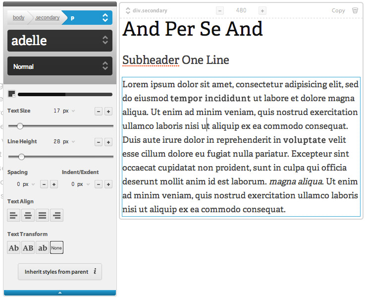
Typecast

2. Define a good base font-size and accompanying line-height.

Trust your design judgement. I might write a follow-up post about finding a good font-size and line-height. Let me know via twitter or in the comments if you are interested!

3. Find your interval number

This is what it is all about. Divide your line height by three or four and remember it. Never fucking forget that number, it is the heart and soul of your design and it will define everything. It’s okay to think in pixels, but I prefer to think of it as a unitless number.

A typical example would be Helvetica set at font-size: 18(px) and line-height: 28(px). Dividing the line-height by 4 will give me the interval number 7. Every following thing I do will be based on the number 7. A piece of sidebar text set at font size 15 that looks weird on a line height of 28? Set it at a line height of 21 (7 × 3). A header running over two lines, set at font size 30 that looks weird on a line height of 28 or 56 (28 × 2)? Set it at a comfortable line-height of 42 (7 × 6).

4. Set up a Grid in Photoshop for some Baseline Grid guidance.

In Photoshop CS6 on Mac Os X, you can find the Grid options under Photoshop > Preferences > Guides, Grids & Slices. I prefer using this for the baseline grid so I can toggle my (vertical) baseline grid and (horizontal) column grid on or off separate from each other — I use rulers for my column grids.
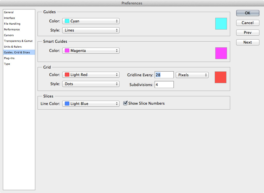
Setting up a Baseline Grid in Photoshop

This is how I configure the options for the Grid:

  1. Style: is set to dots so I can see my grid without it interfering with my design.
  2. Gridline Every: is set to the line-height unit I defined. For example: 28 (pixels)
  3. Subdivisions: is set to the divisions needed to obtain my interval number. If my line-height is 28 pixels and I defined my interval number to be 7, Subdivisions would be 28 / 7 = 4.

5. Write CSS With the Interval Number in Mind

The last step is to write your CSS with the interval number constantly in the back of your mind. Need to define the navigation bar height? Vertical padding or margin values? Line-heights? They should all be multiples of your interval number.

I even like to go as far as get a little Sass aid. I define my interval number in a variable and use that to calculate the various numbers throughout my stylesheets. Saves a ton of time, especially if you decide to change your interval number at some point. If you prefer writing your CSS without a preprocessor, Alfred for Mac is an awesome app to quickly do some calculus if you’re lazy like me.

Things Will Break

Last but not least: some things will break your vertical rhythm. This is perfectly normal. A vertical rhythm is important to create a coherent look and feel and a pleasant reading and scanning experience. But when your design gut feeling tells your something different, please listen to your gut feeling.

What is your experience with vertical rhythm / baseline grids? I’d be happy to hear about it in the comments.

Read Up on Vertical Rhythm

These are some excellent articles that inspired me to start thinking about vertical rhythm in the first place:

Drop Down Menus

Drop down menus. The Information Architect’s nightmare, a Designer’s solution to a cluttered interface. Sometimes you can, sometimes you better not. But when you do, you want to make sure that your menu drops down following a user action.

That last bit is important. Hovering an element with your mouse cursor is not interaction, it is a state of being. Like walking down the street. Imagine every door opening when you walk past it. That would be pretty annoying.

The Drop Down Menu Done Right

Sure, I have used the hover technique in the past myself. When touch interfaces weren’t even an option to consider. But today, they are. And it becomes all the more clear that :hover is not an intended user interaction. So when I really need them, my solution for now is to toggle them on and off with JavaScript following an onClick event.

I want my dropdowns to be accessible, fast and usable. And I hate expanded menus that suddenly collapse because a script has finally loaded. So the first thing I do is put this inline script in the <head> section of my document, before any other script or CSS reference:

<script>document.documentElement.className += " js";</script>

That tiny piece of code adds a class called js to the <html> element. This class is immediately available to hook other scripts or CSS on. The benefits?

  1. You make sure JavaScript is available when hiding the drop down menu via CSS on document load, which is pretty important for accessibility reasons.
  2. There will not be any visible reflows of your drop down menu on document load because the class is applied before loading and applying CSS.

My HTML looks like this:

<ul>
    <li class="has-dropdown is-collapsed">Main Menu Item
        <ul class="dropdown">
            <li>Subitem</li>
            <li>Subitem</li>
            <li>Subitem</li>
        </ul>
    </li>
</ul>

And my CSS for hiding/showing the menu looks like this:

.js .is-collapsed .dropdown {
    position: absolute;
    top: -9999px
}
.js .is-expanded .dropdown {
    position: static;
}

Finally, I toggle the class via JavaScript. It looks like this in jQuery:

$('.has-dropdown').bind('click touchstart', function () {
    $(this).toggleClass('is-expanded').toggleClass('is-collapsed');
});

The result is an accessible, usable, touch-friendly dropdown menu. You now have the force, use it wisely:

Drop Down Menu Demo

Ideas? I’d love to hear them in the comments. Or feel free to react via twitter.

Tips voor goeie presentaties, van een Ontwerper

Ik zie ze dagelijks. Met liefde vormgegeven kleine stukjes kunst. Geprojecteerd proza op een witte muur. De synthese van een redenering, samengevat in bulletpoints, begeleid door een uiteenzetting van een redenering. Wait, what? Precies: De Powerpointpresentatie.

Beste Powerpointer, u gooit stront op mijn netvlies. Laat overgangseffecten en roze Comic Sans MS voor de kinderen, u bent een professional. Focus en maak keuzes, u heeft mijn aandacht al.

Help, ik wil betere presentaties maken

Blij dat u het vraagt. Ik heb niet alle antwoorden, maar hier zijn al vijf tips die uw presentaties aangenamer zullen maken:

1. Projecteer niet wat u gaat zeggen

Uw presentatie is niet uw spiekbriefje. Ik lees en denk als Lucky Luke: sneller dan u kan spreken. Als de ondertitels van een film twee minuten voorlopen op eigenlijke gebeurtenissen, wordt de film saai. Uw presentatie dus ook.

Een beetje respect mag trouwens wel. Wanneer u mij en vijftig anderen om een uurtje aandacht vraagt, dan vult u een week uit een mensenleven. Uw presentatie goed van buiten leren lijkt me wel gepast.

Concreet: zet geen volzinnen op een slide — tenzij het om een kort citaat gaat bijvoorbeeld. En beperk elke slide tot een tiental woorden. Ik ben gekomen om te luisteren, lezen kan ik op het strand doen.

2. Gebruik een zwarte achtergrond

80% van de presentaties die ik zie hebben een witte achtergrond. Een projector is geen scherm en uw presentatie (hopelijk) geen boek.

Met een witte achtergrond zet u alle aandacht op de presentatietekst. U schijnt met een fenomenale lichtbundel op zwarte letters. Van de spreker is geen sprake in dat beeld: die is duidelijk ondergeschikt. U schijnt uzelf weg. Bovendien verblindt en vermoeit u uw publiek; een uur staren naar een felle witte lichtvlek brengt me niet in de stemming om informatie te absorberen.

Gebruik witte of grijze letters op een zwarte achtergrond: dat is aangenamer voor mij en u zal meer aandacht krijgen als spreker.

Gekko

Dat was een Gekko van Miet

3. Zet letters groot genoeg

Minimum 48 punten, dat is de vuistregel die u best hanteert voor tekst op uw slides. De opbrengst is eenvoudig: er gaan minder woorden op een slide (dat is positief, zie punt 1.). Bovendien bent u zeker dat iedereen in de zaal vlot kan volgen.

4. Éen font, éen kleur, éen gewicht

“Keep It Simple, Stupid!” is een adagio dat ook voor presentaties geldt. Tenzij u designer bent, gebruikt u best éen font, éen kleur en éen gewicht in uw presentatie. De reden is eenvoudig: heeft u een extra kleur nodig, of moet u een woord extra vet zetten om iets te benadrukken? Dan staat er bijna zeker te veel informatie op éen slide.

In een presentatie heeft u trouwens altijd de vierde dimensie mee: tijd. Ook met tijd kan u zaken benadrukken. Niets zo sterk als éen sprekend beeld zonder tekst bijvoorbeeld. Of éen woord alleen op een slide. Door zijn isolement zal het extra benadrukt worden en bij uw publiek blijven hangen. Veel beter dan een onoverzichtelijke slide met vette, oranjegeel benadrukte tekst.

5. Probeer eens zonder projectie

Ik daag u uit om een persoon te vinden die bij het horen van presentatie niet denkt aan powerpoint of projectie. Niet zo lang geleden was het nochtans vrij gewoon om bij een redevoering niets dan het gesproken woord te bezigen.

Een uitdaging, maar wanneer u niets visueel moet laten zien, probeer het dan eens zonder projectie. Zeker de helft van de presentaties die ik in mijn leven heb gezien hadden geen projectie nodig om hun punt te maken. Dat is een beetje eng natuurlijk, zo alle aandacht op u gericht. Maar u heeft een duidelijke boodschap, die inhoudelijk sterk is, toch?

Aanvullingen of redenen waarom mijn tips compleet van de pot gerukt zijn? Welkom zoals steeds!

Fast Load Bars in 49 Seconds

I was cleaning out some old favorites today and I came across this magnificently dry piece of content. Totally worth your 49 seconds.

Of course, you want to make your perfect web app loading progress bar in CSS3. Based on some work done by Chris Coyier, that would turn out to be something along the lines of:

Designmuziek

Muziek is belangrijk in mijn leven. Op potten en pannen slaan als snotbel. Viool spelen en ontdekken dat het niks voor mij is. Later gitaar, piano en vinyl. Al kan je dat laatste in mijn geval bezwaarlijk een instrument noemen—ik ben geen DJ Sneak. Er is in elk geval éen ding blijven plakken: het gevoel dat een goed gemaakt muziekstuk naar boven brengt.

Wanneer ik ontwerp, dan leef ik ook een beetje. Sommige muziek dient om met onversneden aandacht van te genieten. Bij een kruidige Orval, bijvoorbeeld. Of in goed gezelschap. Ontwerpen met Jimi Hendrix “op de achtergrond” vind ik moeilijk. Andere muziek helpt mij echter om in de veelbesproken zone te komen. Wat volgt is een bloemlezing van muziek die daar keer op keer wonderwel in slaagt:

  1. Joris Voorn — From a Deep Place
  2. Maceo Plex — Life Index
  3. Modeselektor — Happy Birthday
  4. Eats Everything — RA Podcast & Essential Mix
  5. Trentemøller — The Last Resort

Ik ben ook begonnen met wat dingen te verzamelen op Soundcloud en Mixcloud. Veel luistergenot en ontwerpplezier!