Xavier Bertels

I’m Head of Product at Phished. Previously CPO at SweepBright and co-founder of Mono.

Web UI Frameworks to Build Better Products

Jen Kramer, in an article on Smashing Magazine (emphasis mine):

A framework is intended to get a website running quickly, with minimum debugging. Customize the heck out of it to look completely different, or change just a few colors and be done. However you use it, you’ll have standardized, documented code that can be easily passed on to another developer for maintenance and tweaking and that looks reasonable and functions well. The code is not perfect of course, but it’s pretty good. It cuts down the time required to create a website, which will make the website cost a bit less, too.

You can replace “website” with “web UI” in that quote. If you are an avid reader of this blog, you know that we like open source and standardisation of building blocks. There are many technical reasons to do so, but there is also a very good business reason, which I find is often misunderstood.

Jen argues that using a framework cuts down build time and thus costs. I realise this was not the big point of her article, but I regularly hear the same argument in conversations with other designers, project managers or business owners. While cutting costs certainly can be a result, it is not the only possible outcome. Building faster can just as well mean iterating and testing more often. It can mean that you have time to focus on parts of the design that matter most. Building faster can mean designing a better product.

Using a framework frees up time. As a company, you can cash in on that time, or you can use it to make your product better. We use standard building blocks because we believe it benefits the product, not our wallets.
The History of Flat Design

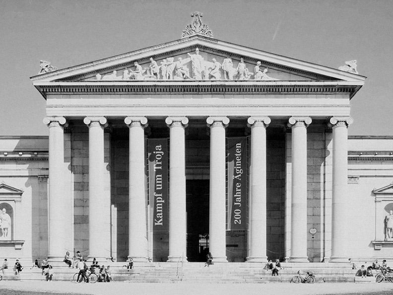
Alain de Botton’s “The Architecture of Happiness” is one of the best design books I recently read. I learned that there used to exist a canon of beauty. During for instance the Classical period, people simply agreed on what a beautiful building looked like. Beauty was defined by architects, who were, at the time, highly regarded artists.

At one specific point, this was the solidified code for a beautiful structure:

For a long time, society agreed that beauty was imposed on an object or structure by an artist – someone who knew how to make something “beautiful”. Emergence of engineering schools like the Engineering Academy of Dresden lead to new knowledge, new technologies, new possibilities — history has a funny way of repeating itself.

Engineers had a different way of approaching architecture. They avoided embellishments and preferred so-called honest structures. Structures where function came before beauty. Structures where the visual and tactile qualities were derived from meaning – as opposed to being imposed by an artist. Modernism was born.

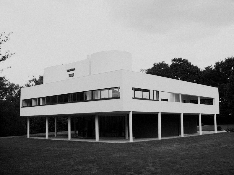
During that period, Le Corbusier designed the Villa Savoye. A building that even today looks like a temple to anyone seduced by modernist views:

Straight lines, pure materials and no useless decoration. Modernist perfection. And also completely uninhabitable, courtesy of a leaking flat roof and generally spartan comfort. What modernism was about on the surface had become something of itself to strive for. The very thing the first engineer-architects were protesting against had now become their trademark. And modernism had become its own aesthetic.

That really made me think. Once we name things, they stop being what they are and become a thing of their own, with an aesthetic of their own worth mimicking. When I hear designers talk about flat design being more honest or better, I think about modernism and Le Corbusier. You cannot name something after its visual aesthetic and then call it more honest. Honest design is much more complex than that.

Architecture has already gone through that phase and I believe we can learn from their mistakes. When we design complex interfaces, there is no benefit to hiding all the complexity behind an apparently simple visual aesthetic. Design goes much deeper than that. At least 40% of design is defining the problem. Another 40% is convincing everyone in the room that the proposed solution is the right one. “We made it flat.” won’t do.

Machines for Control, People for Service

It’s Friday evening and you rush to take the train home on the Belgian railways. You need to buy a ticket. You move to the back of the queue of the only self-service desk that works. As you play the excrutiating waiting game, you watch the departures board. Your train home is leaving without you and now you have to wait an hour. It’s your turn to buy a ticket. The machine asks you questions. Where are you going? What kind of ticket would you like to buy? Weekend pass? Go-pass? Railpass? You wish you could ask someone but decide to try your luck with the weekend pass. You enter the train. As the ticket inspector approaches, you feel uncomfortable about your ticket choice. Too bad: the weekend pass isn’t valid until saturday. You try to reason with the inspector but you lose your temper. You immediately feel bad about making her day worse than necessary. You pay the €150 fine. You’re home late, the dinner your loving spouse prepared is cold and the start of your weekend sucks. You hate the Belgian railways.

Rewind three hours.

It’s Friday evening and you rush to take the train home on the Belgian railways. Your electronic railway pass was linked to your bank account last year. As you approach the automatic doors that lead to the platforms, you hold up the badge and the doors open. You have a connection halfway but the train you’re on is running late. You decide to ask the train attendant. She assures you that the next train will wait until you arrive. You have a pleasant ride home. As you approach the station’s automatic exit doors, you hold up your pass and the doors open. Your bank account is debited with the correct fare. You’re home in time, you enjoy the dinner your loving spouse prepared and the start of your weekend is great. You love the Belgian railways.

We use machines for service and people for control. Wouldn’t it be better if it were the other way around?

Joining Forces

My name is Xavier Bertels and I am a designer at Wolf’s Little Store.

The first version of this post was an attempt at writing a perfect story. A story about my background and about the road that lead to me writing this post on this website. The more I wrote, the less I liked what I had written.

The truth is: this is no longer the story of one or two or three or twenty individuals. This is now the story of an interface design company in Belgium, trying to figure out how to make everyone’s life a little bit better. We believe we can do that by making our daily contact with machines more usable and more beautiful.

Today, Wolf’s Little Store is announcing an expansion of the company. We’re doubling in size. We’re ready to do our best work. And if you feel your customers deserve an enjoyable interface, have a look at our portfolio first. We like to work with clients that know what they get into. We know we do our best work that way. And you deserve the best work.

This Is How You Solve Real Problems With Design

I love this talk where Paul Bennett from IDEO shows that designing a better experience is not necessarily about making amazing graphics or redesigning an entire space. Designing a better experience starts with mastering empathy. It starts with observing and analysing the experience your customers already designed for themselves. You can then go ahead and amplify their solutions or fix any problems they encounter. Design is in the details:

Bonus tip: watching a Google Analytics dashboard will not help you with this kind of problem. Metrics will only get you so far.