Xavier Bertels

I’m Head of Product at Phished. Previously CPO at SweepBright and co-founder of Mono.

The Integration of Everyday Things

“It’s no use going back to yesterday, because I was a different person then.”
– Alice, in Wonderland

There is more to design than what appears on a screen. People talk about no UI and artificial intelligence these days. They are the hot new thing. It is alluring to think of them as the ultimate manifestation of minimalism; self-driving cars and digital personal assistants that know where you want to go today. They make us dream of a better, more frictionless future. One without a UI.

I am not ready to jump on the no UI bandwagon just yet. Au contraire, I believe that people will always want an interface to a tool. No matter how complex that tool becomes in the future.

A good tool is irreplaceable.

I do agree that the definition of UI (design) is changing. Design is purpose or planning that exists behind an action, fact, or object. An interface is a point where two systems, subjects, organizations, etc. meet and interact. Until now, in practice, we have used a crippled definition of those words. In most designers’ heads, UI refers to a screen and design refers to what happens on said screen. As systems become more integrated, what a designer does will shift towards a more holistic approach.

That change will not be without friction. Many design theorists describe how flat design is harming usability. Some important design voices have criticized Apple1 for ‘giving design a bad name’. And you cannot blame them. When you look at design through the lens of usability on screen, things are a mess – on every platform.

A focus shift

However, I think we are experiencing a focus shift. We have created so many different tools that it has become time to take a step back and view the bigger picture.

Let us take Apple as an example. The company has always focused on integrating all of the different components. The difference is there are many more components now than ever. Apple plans for an optimal experience across devices and they seem to prioritize real world manifestations of design over the purely visual. That is a practice in finding the right balance. Focusing on usability alone is just as unbalanced as focusing on features is.

My phone lies somewhere in my living room and I receive all text messages and calls on my laptop. I can take a call on my laptop. Or call someone from my tablet. I can voice-command my phone to turn on my lights, or to set a certain mood. “Hey Siri, Relax”. I can stream any music I want from the internet to my living room speakers. Wireless backups run without noticing and there was never a need to configure much. I am less worried about downloading software from dubious sources because I have a pretty secure App Store. All those things are design as well. It takes some excellent designers and engineers to deliver that kind of tightly integrated, mostly worry free life / work environment.

And this shift is a bigger shift that other companies are making as well. Apple is only one example of a company doing it particularly well. Design is on top of its game. What changed, is the game.

It’s no use going back to yesterday, because I was a different person then.

Welcome to the integration of everyday things.
1 Read ‘How Apple Is Giving Design A Bad Name’ on co.design

I Collect Things

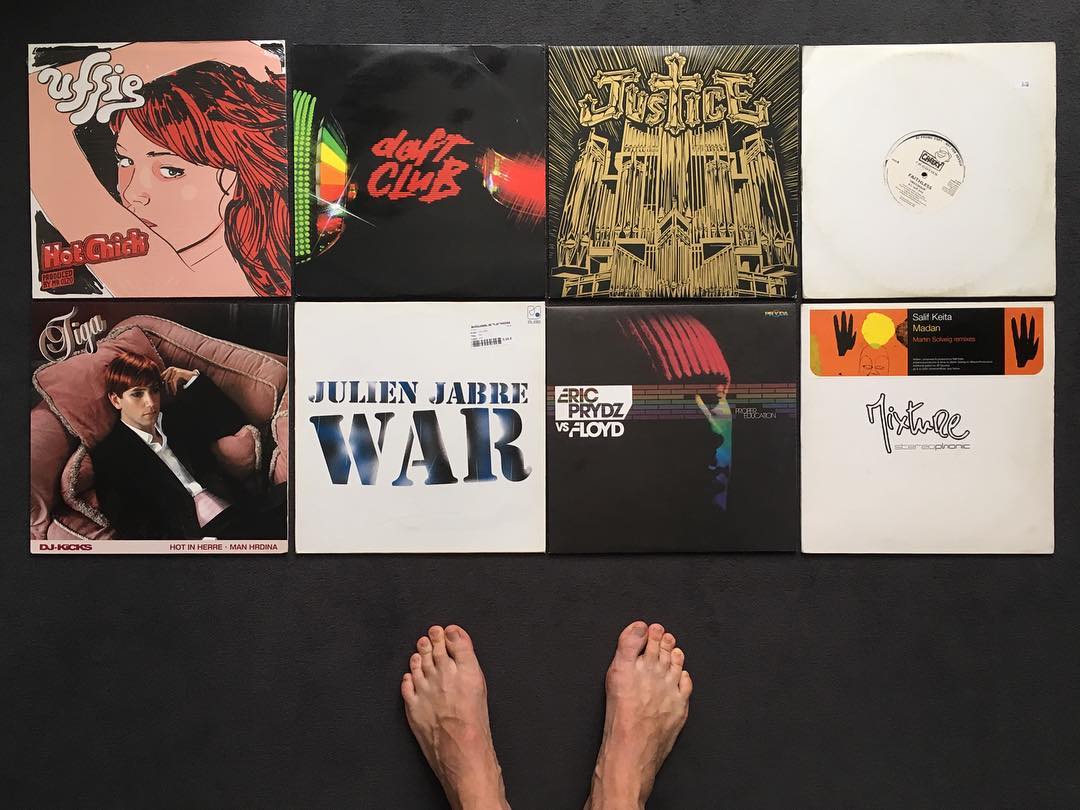
I admit, I am a sucker for things that are well-made. I guess it is one of those traits that come with designers. You learn to recognise something that is well-considered, balanced, well-executed . . . and you buy the thing. It can be tea, music, whiskey, books, a great pen, a knife, new shoes, a nice watch, a car or a house. Anything that feels like someone made deliberate choices in the production process, is worth collecting, inspecting.

A collection of vinyl records and toes.

I also have a constant urge to learn about new things. If I like a song, I will download the album. If I don’t like the album, I will keep it on file. The song is part of the album, the album is part of the song. One does not exist without the other in my world.

The biggest weapon you have as a designer is your taste. I think it is only natural to develop that taste by exploring new things and forming an opinion of them – or so I tell myself.

For this reason, I enjoy browsing through other people’s book lists. It is a way to discover new things: stories, opinions and facts. So I decided to collect books on my website. The collection only contains a couple of books for now and I will add books in the future. Maybe other things will follow.

Branding in Apps & Software: Brand Loudness

Something I have explained to clients in recent UI design projects is the concept of Brand Loudness. I was surprised to find that not many people use this concept to navigate their different brand assets. It helps to make smart design decisions while reinforcing your brand. Time to dive into it a bit deeper.

You already have a Brand Loudness scale

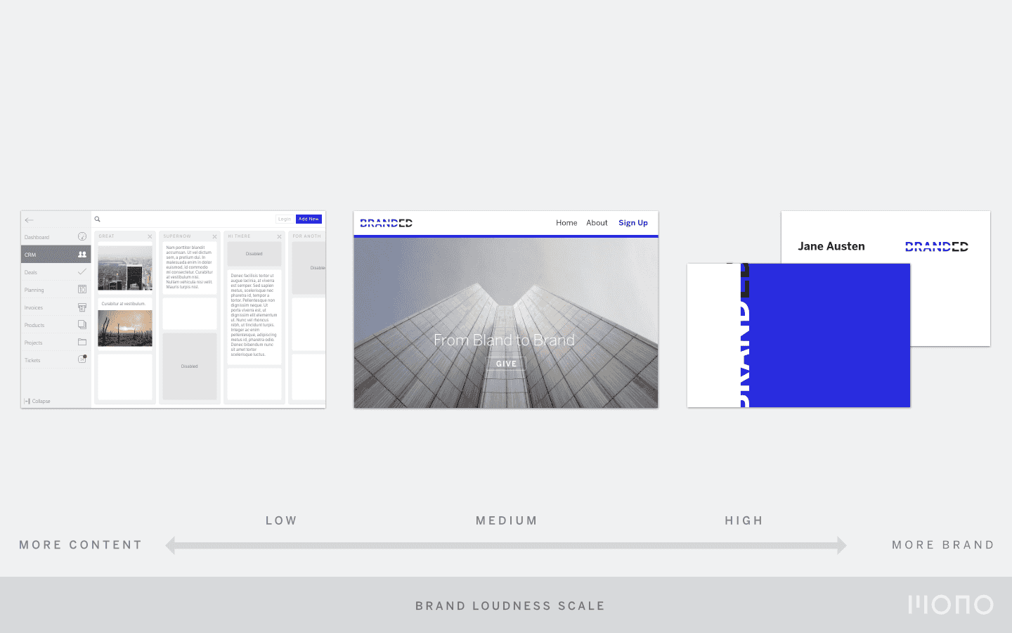
Brand Loudness is a subjective term. It indicates how customers perceive the loudness of your brand for a particular brand asset. Say, a name card versus a mobile app. One should appear louder than the other. My guess is you know which.

Brand Loudness is a scale on which you can map various brand assets. You might not know it, but you probably already have a scale. I bet your namecards feel more branded than, say, your website. And that is great news. It means your designers have taken the purpose of each asset into account.

A namecard can be bold and loud. Your web app should let the content speak first. And your chat service should completely integrate with the platform.

Now you should make it explicit

Brand Loudness is a tool that can be part of your brand guidelines. Powerpoint will get you a long way to map out your current assets and put them on a scale from subtle to loud. We help our clients create this if we feel they need it.

It can look like this:

An example of a Brand Loudness Scale

Once you make Brand Loudness an explicit part of your brand guidelines, you can evaluate current brand assets. Sometimes your brand is loud, sometimes it is subtle. All brand all the time will drown your customers in a sea of noise. A dot of colour stands out when it is surrounded by a sea of whitespace.

Your brand is a continuum

I work with interfaces every day. Some are more complex than others, all of them have a high degree of interaction. The cornerstones of branding seem juxtaposed with good user interface design. Brand should be in your face, memorable, omnipresent. In software applications, you want the content to be front and center. And the brand to move out of the way.

For a UI designer, this is a typical predicament. We might get a briefing from the marketing department that the logo should be on every screen of the native mobile app and that all buttons should be red. This becomes a design problem. And the result is a digital tool that nobody really wants.

In reality, branding and UI design work together. If you take into account Brand Loudness. A brand has multiple dimensions: what it looks like, what it feels like and also how it evolves over time. It helps to see brand as a continuum, not a fixed event. A Brand Loudness scale will help you to navigate that continuum and design better software and applications. Which will reinforce your brand.

The Stress Barometer

I was talking with a friend today about stress. Building a company sure can be stressful on occasion, how do you know if you are too busy or not? It is easy to lose track of time and space, and also your health.

Photo by Akban Martial Arts

I told my friend that my barometer for whether I was working too hard is sports. Twice a week, I go to martial arts class. I rarely miss a class, but when I do, I know it is a stressful period and I should take a step back, look at the big picture, and reorganise. It is my stress barometer and it helps me keep an eye on my mental and physical health. Which is too easy to let slide when you are building something you love.

Growth, Choice & Focus

I have jokingly said to people that me and my business partner could start a second company. We get so many requests for digital marcom work. We could grow it to twenty people fairly quickly. We would be good at selling it and the work would be excellent. From a revenue perspective it would be a smart move.

Some days, you feel like you are missing out on a lot of good business. “A company can only have a big impact on the world if it gets big.” While that sentence resonated with me for a while, I think I disagree. You can also have a big impact with very focused and extremely well-executed actions.

My key metric is the quality of the work we do: is it better than last year? Are we working on more interesting things? If so, good. We design applications that people want. Growth is secondary. It brings all sorts of problems that distract from the work. That is why we grow only if we genuinely feel it improves the quality of design. That is our focus. That is our choice.